Today I’m sharing my favorite paint colors. Paint colors can form the backbone of a well-designed home. The right shades create flow, warmth, and longevity while adapting to different rooms and lighting conditions. Over time, I’ve returned to the same favorite paint colors again and again because they work consistently in real homes.
These are the paint colors I trust most for their versatility, depth, and timeless appeal.
Benjamin Moore Neutral Paint Colors for Everyday Spaces
Neutral paint colors create the foundation of a home. When chosen well, they feel layered and intentional rather than flat.
White Dove
A soft, creamy white that works beautifully on walls, trim, and cabinetry. It feels warm without turning yellow and adapts well to changing light.
Ballet White
One of my favorite paint colors for warmth without heaviness. Ballet White pairs especially well with stone, wood tones, and classic architectural details.
Oxford White
Clean and crisp without feeling stark. Oxford White works well in spaces that benefit from brightness and clarity.
Revere Pewter
A long-time favorite neutral with balanced undertones. Revere Pewter performs beautifully across open floor plans and connected rooms.
Benjamin Moore Paint Colors With Depth and Character
Deeper shades add richness and grounding to a home. These favorite paint colors work especially well in spaces meant to feel cozy or dramatic.
Knoxville Gray
Despite the name, this color reads as a deep green with gray undertones. It feels sophisticated and grounding, making it ideal for studies or cabinetry.
October Mist
Soft and organic, October Mist brings calm without feeling muted. It works well in living areas and bedrooms where subtle color is welcome.
Tarrytown Green
Rich and timeless, this green adds character without overpowering a space. It pairs beautifully with warm metals and natural textures.
Farrow & Ball Paint Colors I Always Return To
Farrow & Ball colors offer depth that shifts throughout the day. These are the shades I rely on most often.
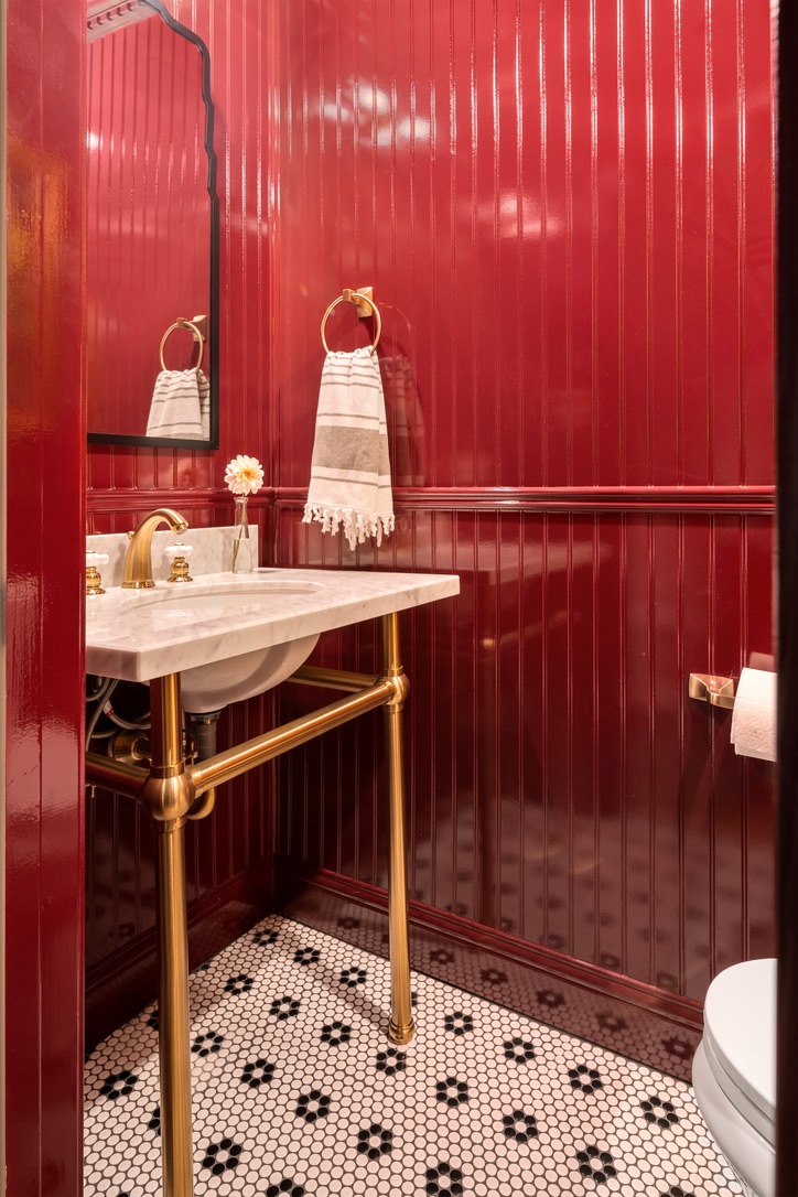
Preference Red
Bold and classic, Preference Red works best when used intentionally in rooms that can handle drama, such as dining rooms or libraries.
Dead Salmon
A complex, earthy pink that brings warmth and personality without feeling trendy.
Light Blue
Fresh and understated, this shade feels calm and relaxed. It works well in bedrooms and bathrooms.
De Nîmes
A deep, architectural blue that adds structure and richness. De Nîmes works beautifully in offices and moody living spaces.
Setting Plaster
Soft and warm, Setting Plaster creates a flattering backdrop that layers well with natural materials.
How I Use These Paint Colors in Real Homes
I rely on these favorite paint colors because they perform well across different lighting conditions and architectural styles. Each one offers flexibility while still adding personality.
Cherry Blossom Home uses these shades across many projects. We offer full-service interior design in Alexandria, Virginia and Northwest Arkansas. Virtual design services are also available to clients across the United States.
Final Thoughts on Paint Colors
Paint colors are not about trends. They are about choosing shades that support how you live and how your home feels over time.
These are the colors I trust because they create spaces that feel layered, livable, and enduring.