


As an interior designer serving Phoenix and Scottsdale, AZ, I often find inspiration in the natural world. Whether you’re nestled in the lush landscapes of Northwest Arkansas or the historic charm of Northern Virginia, nature-inspired moody color palettes can transform your home into a sanctuary that reflects the beauty of the outdoors.
Why Choose a Moody Palette?
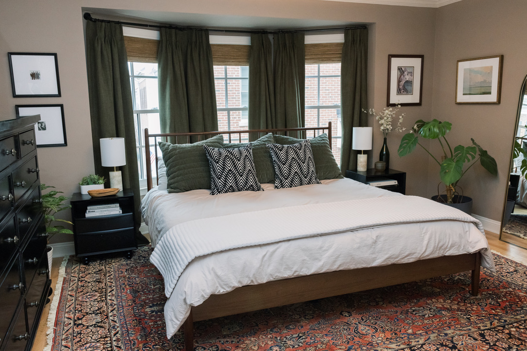
Moody color palettes are more than just dark and dramatic; they offer a sophisticated, layered look that adds depth and character to any room. By incorporating deep, nature-inspired hues, you can create an atmosphere that feels both grounded and luxurious. These colors evoke the quiet strength of the natural world, making them an ideal choice for homes in the River Valley Arkansas area and beyond.
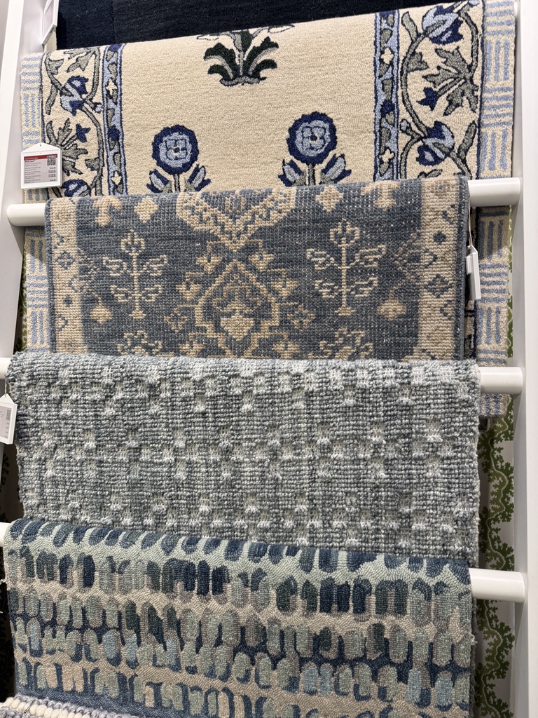
Key Colors to Consider
1. Forest Green: This deep, verdant shade is reminiscent of dense woodlands and offers a calming yet invigorating presence. It pairs beautifully with warm wood tones and brass accents, making it ideal for living rooms or studies.
2. Stormy Blue: Capture the mystery and power of the sea with a dark, muted blue. This color works well in bedrooms or bathrooms, creating a peaceful, cocoon-like environment.
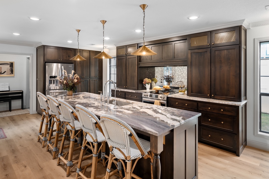
3. Earthy Browns: Rich, chocolatey browns evoke the warmth of soil and tree bark. These tones are perfect for creating a cozy, inviting atmosphere in dining rooms or dens.
4. Burnt Orange: Inspired by the fiery hues of autumn leaves, burnt orange adds a pop of warmth and vibrancy without overwhelming the space. It’s a great choice for accent walls or textiles like throw pillows and rugs.
5. Deep Maroon: Channel the richness of autumn berries and wine with a deep maroon. This color brings a touch of luxury and warmth to any room, making it perfect for a statement wall in a bedroom or living area.
While moody color palettes are all about embracing darker tones, balance is key to avoiding an overly somber space. Here are a few tips to keep the mood just right:
– Layer with Neutrals: Soften the intensity of moody colors by incorporating neutral tones like beige or cream. This will keep the space from feeling too heavy and add depth.
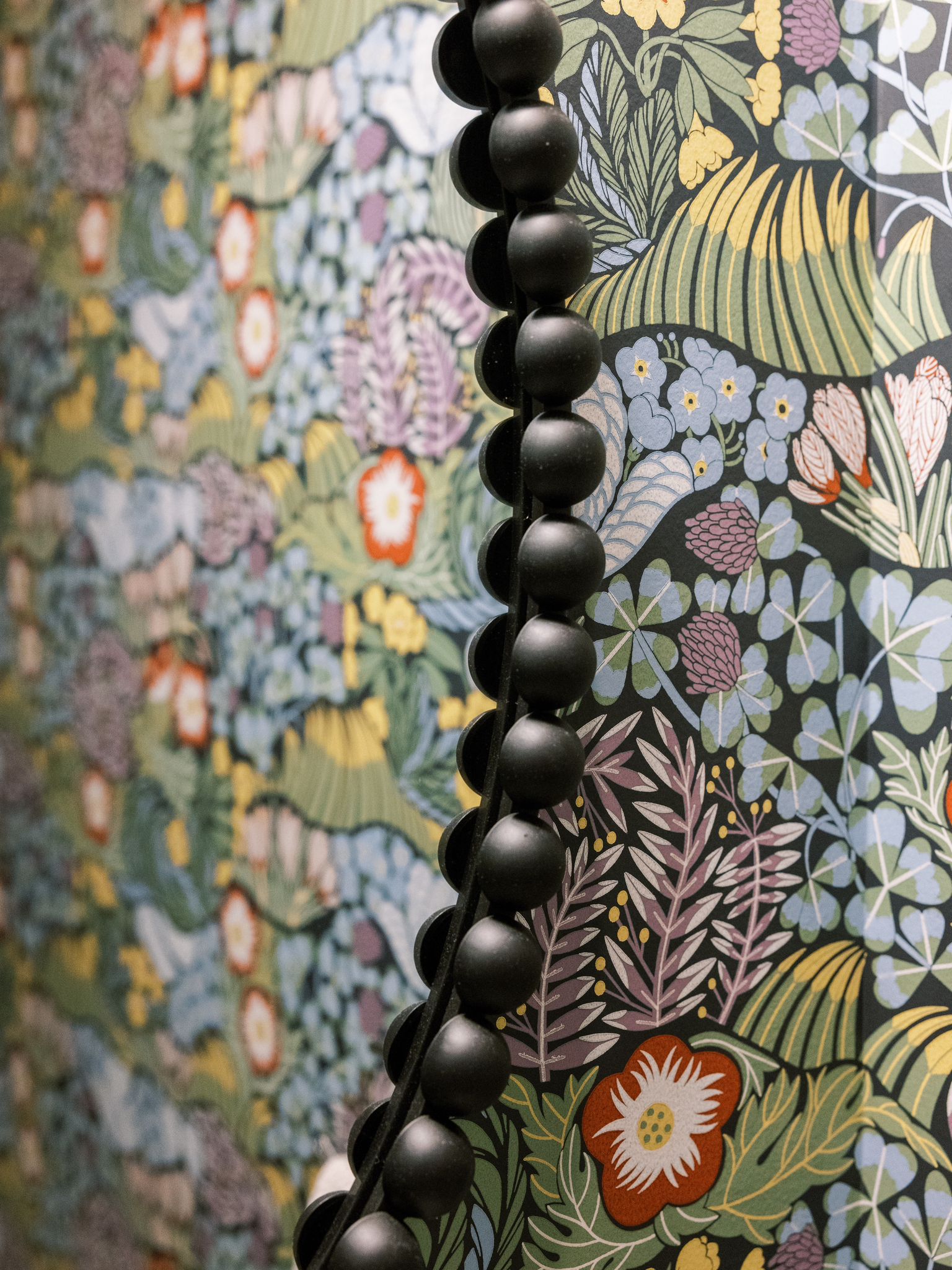
– Play with Texture: Velvet, wool, and natural wood elements can enhance the richness of moody colors, adding dimension and interest to your design.
– Let in the Light: Natural light is your best friend when working with dark colors. Large windows, sheer curtains, or strategically placed mirrors can help reflect light and brighten the room.
One of the best things about nature-inspired moody palettes is how they connect your interior with the natural world. Consider adding houseplants, wooden furniture, or stone accents to reinforce this connection. These elements not only complement moody colors but also bring a bit of the outdoors inside, enhancing the organic feel of your space.
Nature-inspired moody color palettes are perfect for those who want to create a home that feels both cozy and sophisticated. By embracing deep, rich colors and balancing them with lighter elements, you can design a space that is as beautiful as it is inviting. Whether you’re looking to transform an entire room or simply add a touch of nature to your décor, these moody hues are sure to make a lasting impression.
Ready to bring the beauty of nature into your home? Let Cherry Blossom Home, your trusted interior designer in Scottsdale and Phoenix, Arizona help you create a space that reflects your love for the outdoors with a touch of moody elegance. Follow us on Instagram @cherryblossomhomeinteriordesign for more design inspiration, and visit CBH to explore our full range of services.